Why the Lay’s Logo Is So Effective (Hidden Design Meaning Explained)
The Lay’s logo isn’t just simple branding—it’s carefully designed to influence how we feel about the product.
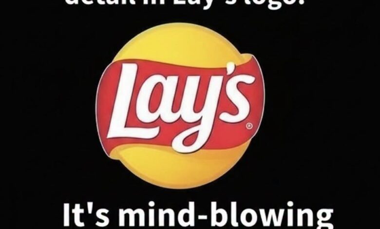
✔ The bright yellow circle creates warmth and instantly reminds us of golden, crispy potatoes
✔ The red ribbon shape adds movement, energy, and attention-grabbing contrast
✔ The rounded font makes the brand feel soft, friendly, and easy to trust
✔ The design avoids real chip images and instead uses color to trigger appetite and emotion
This combination makes Lay’s instantly recognizable in seconds—even from across a store shelf.
Life lesson:
Great design isn’t just seen—it’s felt.